
.png)
Digital Healthcare for All: Designing Equitable Access in Africa

Digital Healthcare for All: Designing Equitable Access in Africa
Zencey is a health insurance provider dedicated to revolutionizing healthcare in Africa by making healthcare more equitable and accessible to all.
My Role: UX Researcher
Stakeholders: UX Designer, Development Team, Founder & CEO, Product Owner, Product Manager
Challenge: Simplify and modernize the app's design, focusing on the onboarding process, symptom checker, and physician scheduler
Tools: Zoom (User Interviews), Mural, Figma, CheckMarket
Duration: 3 months

Healing the Gap: Project Objectives
In rural Africa, long distances, scarce providers, and limited communication create a devastating cycle: patients endure arduous journeys only to face potential delays in care, increased risk of preventable diseases, and tragically, higher mortality rates due to limited access to quality care.
Our goal was to design a user-friendly telehealth application that empowers individuals with the information and resources they need to manage their health, ultimately improving access and outcomes for underserved communities.
The Roadblock: Limited Access to Patients
Our ability to gather direct user feedback was significantly impacted by the limited access to patients. This constraint presented a unique challenge, as it prevented us from directly observing user behavior, understanding their pain points firsthand, and gathering in-depth insights into their needs and preferences. As a result, we had to rely heavily on secondary research, unmoderated usability testing, and creative workarounds to gain a deeper understanding of the user experience.
Credits
For this project I was the UX Researcher who:
-
Conduct a competitive analysis of telehealth apps
-
Interviewed UX Specialists in Africa to understand cultural nuances
-
Performed a UI audit to identify usability issues
-
Created a journey map of the patient experience
-
Developed user personas for design guidance
-
Prototype creation based on low-fidelity wireframes
-
Conducted usability testing throughout the design process

Charting a Course for Success: A Competitive Analysis of Healthcare Apps
To better understand the landscape and identify best practices/areas for improvement, I carefully studied seven top healthcare apps
I found that competitor apps work well when they're easy to use and let you schedule appointments smoothly.
However, some apps charge extra money and make it challenging to find the right pharmacy.
Interestingly, many successful healthcare apps in Africa use WhatsApp, which is very popular in Africa. This inspired us to create an app that's easy to use and works well with how people already communicate, making it more accessible and enjoyable for everyone.
Unveiling Cultural Nuances: Conversations with African UX Experts
To gain insight in cultural nuances and common UX/UI pain points specific to the African context, we conducted six interviews with UX experts across the continent, gaining valuable insights into digital life.
A key finding was the need to optimize apps for older devices, as many users still rely on them, risking frequent crashes if not addressed.
Additionally, accessibility emerged as crucial, with a strong emphasis on robust voice interfaces to support users in regions with lower literacy rates.

Improving Healthcare Access: A UI Audit for a Better Patient Experience
Our audit of the initial Zencey app revealed several opportunities for improvement. While we focused on enhancing clarity, cohesiveness, and ease of use, a deeper dive revealed gaps in accessibility.
For example, while we simplified iconography, we didn't explicitly consider color contrast for users with low vision or provide alternative text for images. Similarly, while we aimed for flexibility, we didn't fully address the needs of left-handed users or offer options for user customization.
Recognizing these limitations, we incorporated key Universal Design principles into our design recommendations.
By prioritizing inclusivity from the outset, we aimed to create an app that is not only user-friendly but also accessible to a wider range of users, including those with disabilities.
Who Are We Designing For? Crafting Personas for Our Healthcare App
We utilized the insights from our user experience research to create user personas, gaining valuable understanding of the experiences and challenges encountered by potential users. This information served as the basis for crafting detailed user personas.
Prioritizing our users' needs was crucial to the development process, guaranteeing that the app would not merely be a technological solution, but a meaningful tool that genuinely empowers individuals in their healthcare journeys.
Personas

Farah Habib
Bio: A busy young professional works long hours and has a schedule that can make seeing a physician inconvenient.

Musa Umar
Bio: A low literacy young adult who is seeking easy, quick access to providers and medications
The Patients' Story: A Journey Mapping Perspective
The original Zencey app was based on stakeholder intuition and lacked insight into the patient experience.
To understand health complexities, we mapped the entire patient journey, identifying pain points like scheduling issues and confusing interfaces.
We also considered healthcare practitioners' challenges, allowing us to create a solution that benefits both patients and clinicians. This human-centered approach shaped our design process, focusing on the needs of all stakeholders.

Unveiling Usability Challenges and Iterating Towards Success
Recognizing that the initial Zencey app was developed without a complete understanding of user needs and not having the opportunity to interview patients and providers, we made usability testing a priority.
We tested existing solutions and carried out low-fidelity wireframing tests concentrating on three key tasks: signing up, finding a doctor, and using the Symptom Checker.
We addressed challenges found during the current solution usability testing to guide our low-fidelity wireframe creation.
Current Solution Usability Testing
We conducted initial unmoderated usability testing with five patients.
Initial usability testing revealed shocking insights.
-
A dismal 17% success rate for sign-up highlighted a major usability hurdle.
-
Furthermore, the System Usability Scale (SUS) score indicated a low likelihood of app adoption.
These initial findings underscored the importance of a user-centered design approach.
Low-Fidelity Wireframe Testing
We conducted unmoderated usability testing with six new patients, focusing on the same core tasks.
-
While the success rate for finding a doctor initially decreased slightly (from 67% to 60%), this unexpected result pointed to a UI inconsistency that we were able to address promptly in the high-fidelity prototype.
-
The sign-up success rate soared to 100%, and the symptom checker maintained a high success rate.
-
Significantly increased user confidence and satisfaction, as reflected in the improved SUS scores.
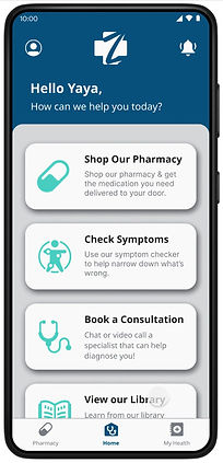
A Glimpse of the Future: Exploring the Zencey App Prototype
Our journey began by addressing the critical issue of onboarding. Through iterative testing of low-fidelity mockups, we witnessed a remarkable 84% improvement in user success rates, demonstrating the power of user-centered design.
Inspired by the success of WhatsApp across Africa, we integrated similar communication features into the symptom checker, fostering trust and familiarity.
Recognizing the importance of health literacy, we introduced a dedicated "Learning Hub" to empower users with valuable health information.
Furthermore, we meticulously addressed usability challenges within the consultation feature. By improving contrast, clarifying appointment scheduling, and enhancing the clarity of chat consultations, we aimed to create a more intuitive and user-friendly experience.
Navigating Challenges: Insights from the Zencey App Redesign
Reflecting on this project, several key lessons emerged.
User Research
The most profound was the critical importance of user research. While the initial plan included in-depth user interviews, unforeseen circumstances limited our direct access to potential users. This limitation highlighted the crucial need for meticulous planning and the exploration of alternative research methodologies.
This experience underscored the power of mixed-methods research. Had we allocated more time to the planning phase, we could have implemented a more robust research strategy, potentially incorporating A/B testing, card sorting, and more comprehensive user surveys to gain a deeper understanding of user needs and preferences.
Dedication to Design Principles
Furthermore, this project served as a valuable introduction to the world of UI/UX design within an existing application. I witnessed firsthand the detrimental impact of inconsistent design choices and the importance of adhering to established design principles. The lack of a dedicated UX team within the organization became evident as numerous usability issues arose from seemingly minor inconsistencies.
Communication and Collaboration
Finally, this project reinforced the importance of effective collaboration and communication within a design team. Working with multiple designers presented unique challenges in maintaining design consistency across various screens and components. This experience emphasized the need for clear design guidelines, regular team communication, and a shared understanding of the overall design vision.